
One of the biggest parts to realistic shadowing is change the color of a drop shadow, rather than using the standard “black.” This tutorial will show you a down and dirty way to make a tinted shadow in ANY version of Adobe Photoshop Elements, or in any graphics program that uses layers. In fact, this is how we did it in Photoshop years ago before they added the drop shadow style element.
Perhaps your first question is why you would want a different color for a drop shadow. For some items, the black color is just fine. But usually, it is more realistic to make your shadow the same hue of your background, but darker. After you see the difference, you will have a better understanding.
First, get a digital background paper of your choosing. Then open the digital element you would like to shadow, and place it on top of your background. In this case, I chose a paper from the Sunny Sunshine kit by SAS Designs, plus a piece of notebook paper from the same digital kit that I want to shadow. In this example, I added the standard “low” drop shadow that comes with Adobe Photoshop Elements.
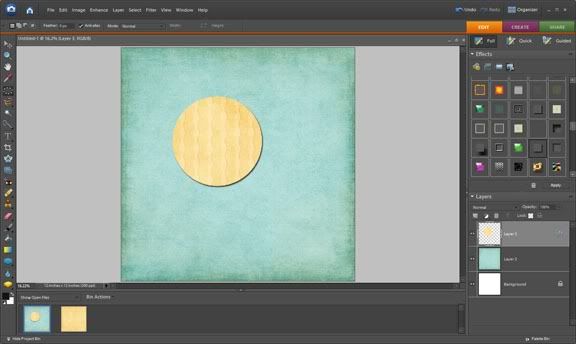
Note that the shadow on the digital notebook paper looks a bit harsh. Let's fix this!
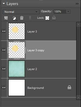
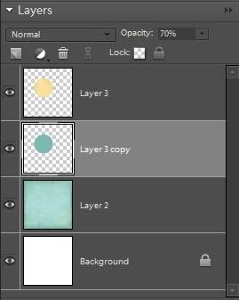
First, we will undo the drop shadow. Then we will duplicate the notebook paper layer. To do this, right-click on the notebook paper layer and choose “Duplicate Layer.” Move the Layer Copy below the original notebook paper layer.
Right-click on the Layer 1 copy thumbnail and choose “Select Layer Transparency.” This will put “marching ants” around your notebook paper. What we want to do is fill this layer with a blue that is the same shade of our background, but darker.
Go to Edit> Fill Selection.
A new dialog box will appear. Here, you want to select “Use Color” from the drop-down menu, and, using the mouse, move the cursor over the background until the Eyedropper Tool appears. Select the background color. Then go to the Color Picker and directly below the circle selector on the Color Picker, select a darker blue than the background color. This is trial and error. Choose a color that would make a realistic shadow color. You don't want it too bright, but more on the dull side. Keep it a tad south of the original spot to keep it duller.
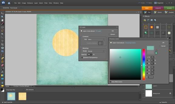
Click “OK.” Click Select> Deselect to lose the marching ants.
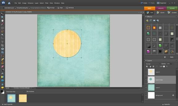
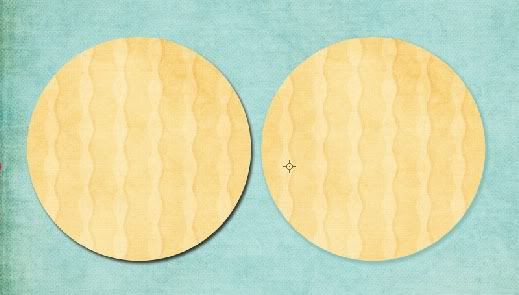
Next, we want to put the shadow in a realistic place. Select the layer of the blue copy you just made to make it active, and click the Selection Tool in the upper left hand corner of your screen. Move this layer down two spaces (or pixels) and to the right two spaces (or pixels), using the arrow keys on your keyboard. This is your most natural size and placement of a shadow, but again, this is all personal preference.
The shadow is in place, now all we need to do is soften it. First, let's make it a little less opaque. (In real life, you can see through shadows.) Making sure the shadow layer is active, go up to the Opacity slide bar and slide it left, to about 70%.
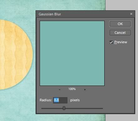
Finally, we want to blur it up just a bit, so the shadow isn't so harsh. With the layer still active, go to Filter> Blur> Gaussian Blur. Choose a radius of about 7.8 to 8.8 pixels. Select “OK.”
You have done it! When all is said and done there is a huge difference.
I know it seems like a lot of work but its pretty simple after awhile. Please feel free to share with us if you use this method on a layout!


 ~Angie~


